Client: Syren Cloud
Industry: Supply Chain & Logistics Technology
Rebranding Syren Cloud for the Enterprise
The Challenge
Syren Cloud had made a significant strategic shift — from traditional supply chain logistics management to a data-driven, AI-first approach to supply chain optimization. The technology had evolved. The team had evolved. The ambition had evolved. The brand hadn't.
Their existing identity communicated small-scale and reserved at exactly the moment they needed to project enterprise authority. In a competitive B2B market where first impressions determine whether you get the meeting, the brand was working against them. They needed to look like the company they were becoming, not the company they'd been.
My Role
I came in as an embedded Art Director and Brand Strategist on a 6-month contract — stepping into their organization, leading their internal design team, and owning the rebrand from strategy through execution. This wasn't a handoff engagement. I was inside the work every day, making decisions alongside leadership and ensuring the visual evolution matched the strategic ambition.
The Approach
The first move was positioning. Before touching the logo or the color palette, I needed to understand what Syren actually stood for in a market crowded with competitors making similar claims. What emerged was a clear differentiator: Syren wasn't just another supply chain software vendor. They were the last-mile partner for data and AI adoption — embedded, outcome-oriented, and deeply specialized in a way the bigger consultancies couldn't match.
That positioning became the foundation for every visual decision that followed.
The old brand communicated the wrong thing at every touchpoint — cautious typography, a dated mark, a color story that felt regional rather than global. In a market where buyers are evaluating you against enterprise-grade competitors, that gap is fatal.
The new brand needed to signal three things immediately: precision, scale, and momentum.
The Identity
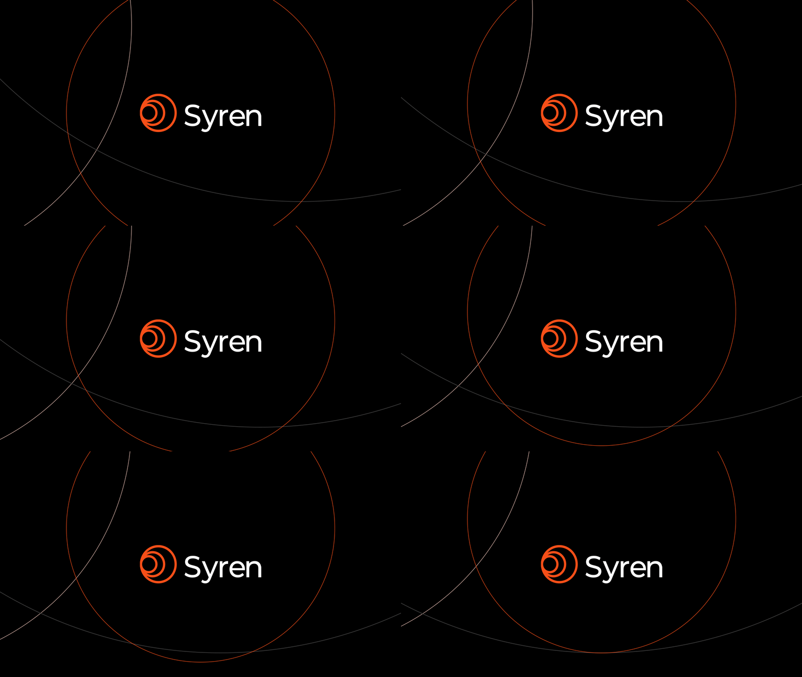
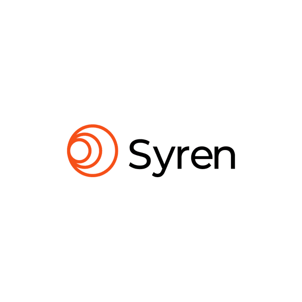
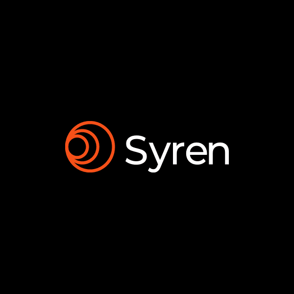
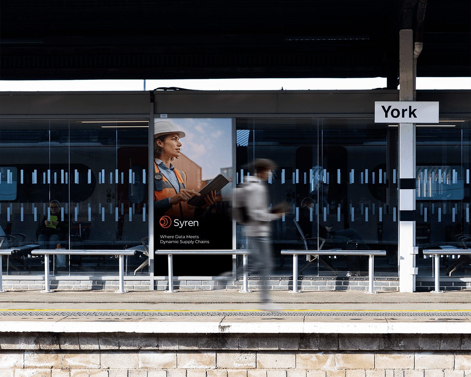
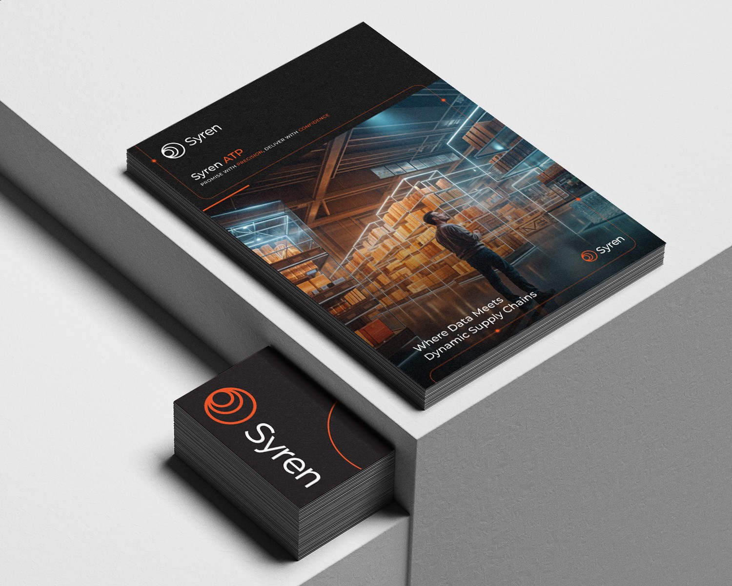
The new Syren mark is built around concentric arcs in motion — a visual system that communicates data flow, connectivity, and forward momentum simultaneously. The orange gradient brings energy and confidence without sacrificing the credibility the category demands. Set against a deep black, it projects the kind of enterprise authority the previous identity couldn't approach.
The wordmark was stripped back and modernized — clean, confident, and built to hold its own next to the biggest names in the category.
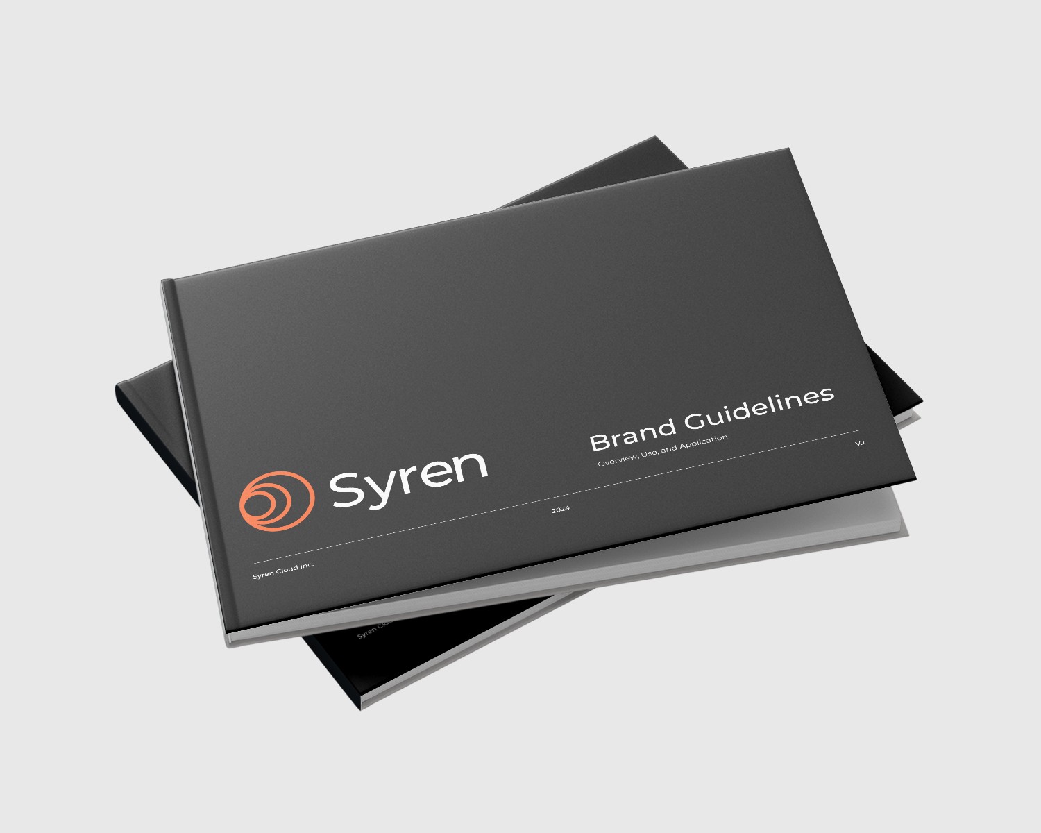
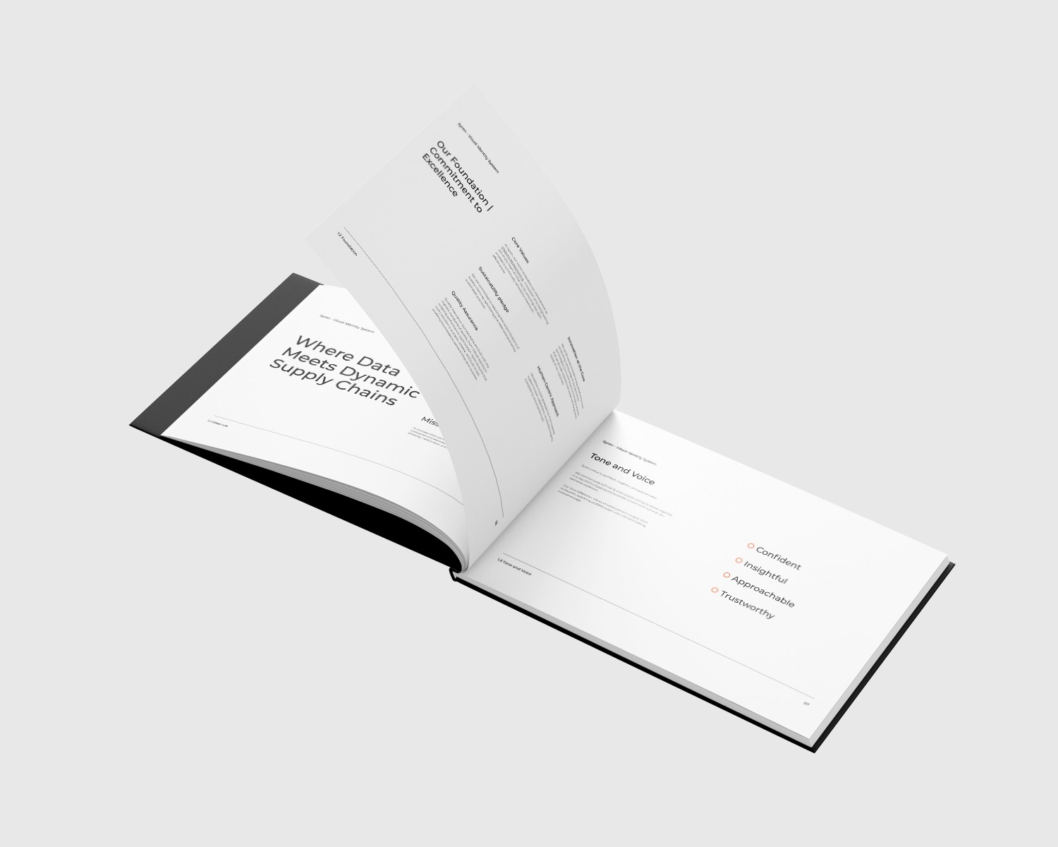
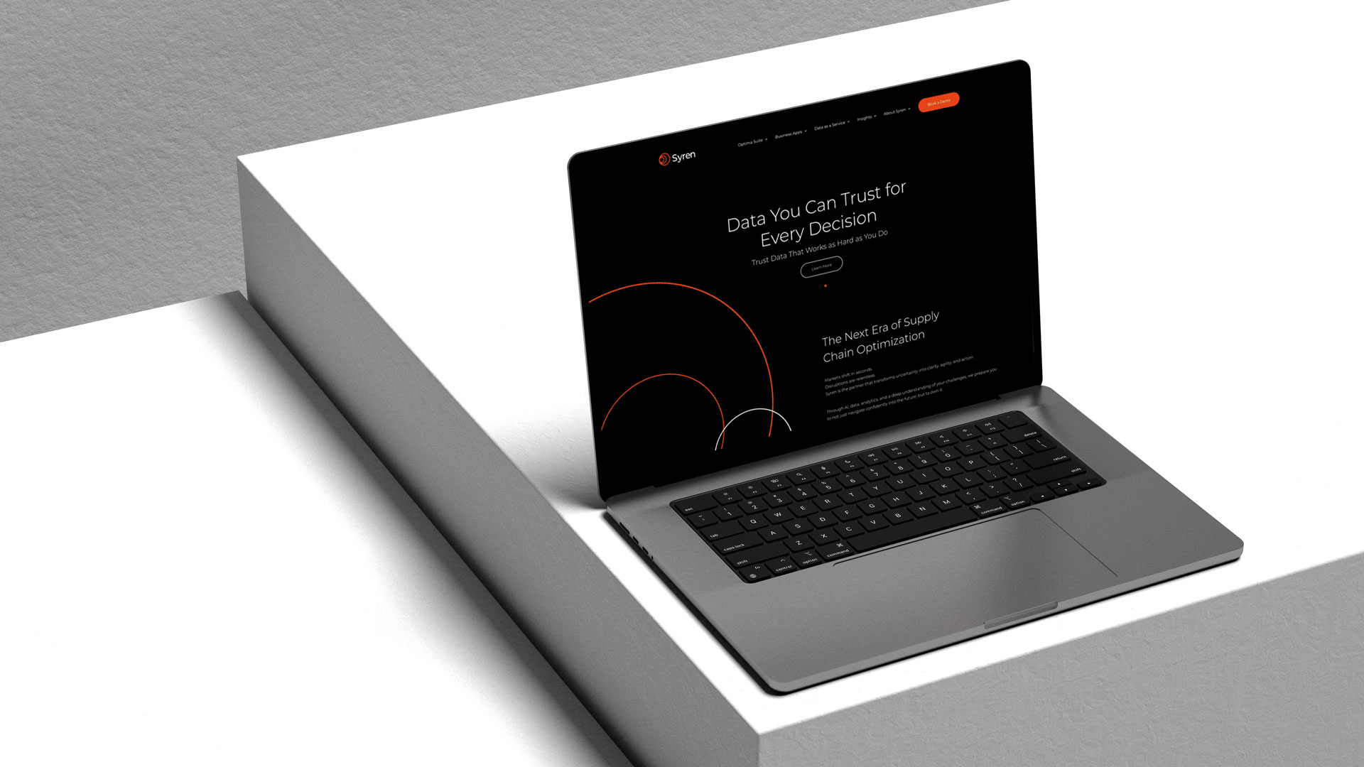
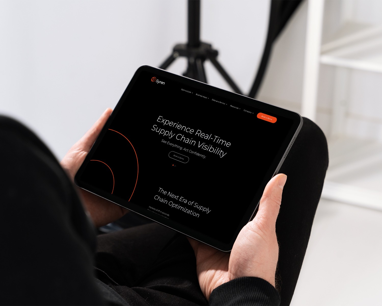
The full system included the logo and mark in all formats, a comprehensive color system built for digital and print, typography selection for clarity and authority at scale, a brand tagline, vision and mission statements, and a website that brought the new identity to life as the primary digital proof point.
The image direction followed the same logic — global scope, human scale. Manufacturing floor to boardroom. The brand needed to feel as at home with a warehouse operator as with a C-suite buyer.



The Deliverables
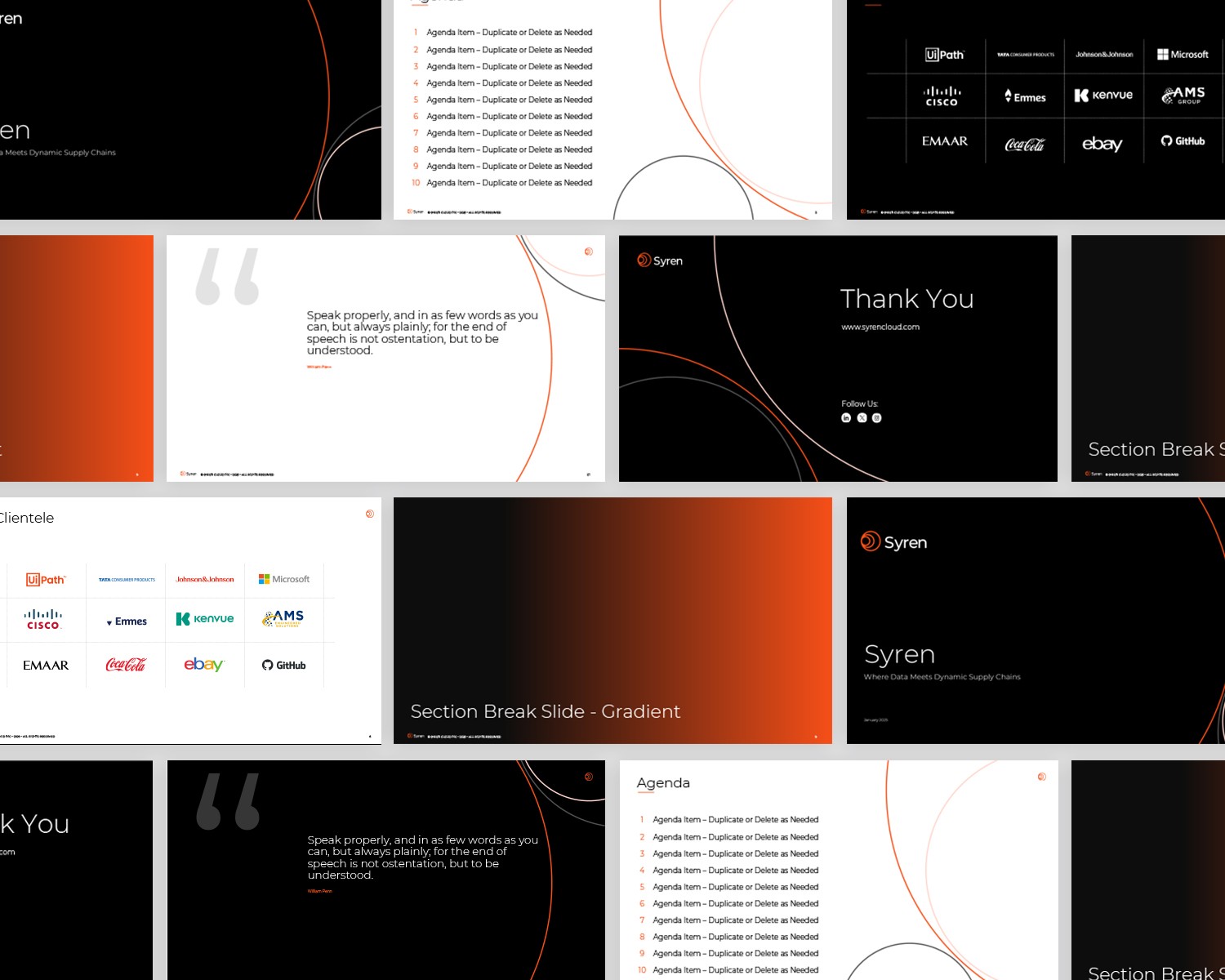
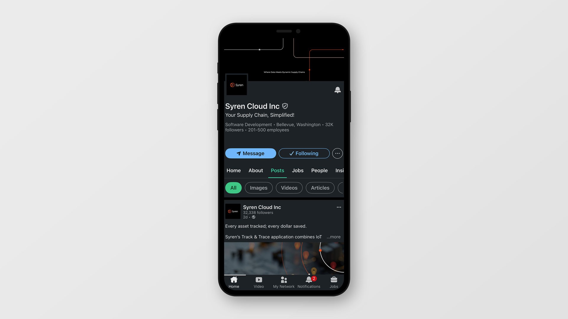
New logo and visual identity system, brand tagline, vision and mission, website redesign, presentation deck system, sales collateral, business cards, and LinkedIn brand presence.
The Outcome
In year one following the rebrand, Syren Cloud saw brand recall and recognition double, their LinkedIn following double, and revenue increase by 30%. Those numbers reflect what happens when positioning and visual identity are genuinely aligned — the brand starts doing the work of the sales team before anyone gets on a call.